Conversion Rate Improvement Playbook That Actually Works

The most popular conversion advice starts in the wrong place. When results weaken, teams often commission a redesign, add more traffic, or change button colors. Those actions feel substantial, but a dramatic visual overhaul rarely solves the specific reason a visitor hesitates.
Conversion rate improvement is a systems problem. Copy, user experience, payment options, page speed, fulfillment expectations, and trust all influence whether someone moves from interest to action. The practical work is less glamorous: establish a credible baseline, find the worst friction, fix the relevant cause, and test the change without fooling yourself.
That discipline matters because modest gains compound. A site moving from 2.35% to 3.5% conversion would produce a relative lift of about 49%, even though the absolute change looks small, as summarized in conversion rate optimization benchmarks and statistics. Richard Maize's career offers a useful operator's lens here. The same habits that help an investor evaluate property operations or a consumer venture also apply to a web funnel: identify the blockage, improve the path, and measure what happened.
Why Conversion Rate Improvement Beats Chasing More Traffic
Buying more traffic is the default response to disappointing numbers. It's also often the most expensive response. If visitors arrive through paid search, partnerships, or content and encounter unclear messaging, difficult forms, or uncertain checkout costs, increasing acquisition sends more people into the same broken process.
The cheaper lever is usually making existing demand work harder. A clearer offer can help qualified visitors understand the next step. A shorter form can remove needless effort. A payment method that fits the customer's habits can prevent abandonment at the final moment. None of those fixes requires a larger media budget.
A conversion program should operate like a management system, not a design event:
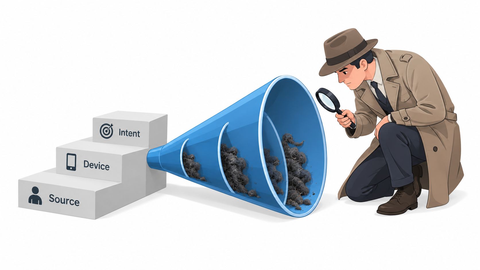
Benchmark performance by device, source, and page intent.
Diagnose friction with analytics, recordings, feedback, and funnel data.
Prioritize one material problem instead of collecting a long list of cosmetic ideas.
Test a specific fix against a clear primary KPI.
Document and compound validated gains over time.
Small wins are the operating advantage
The evidence supports realistic expectations. In one large testing program, 60% of completed A/B tests delivered under 20% lift, 84% stayed under 50%, and only about one in seven produced a statistically significant improvement, according to Convert's review of A/B testing statistics. That isn't a reason to abandon testing. It's a reason to build a portfolio of experiments.
A redesign creates risk because it changes many variables at once. If performance improves, you may not know why. If it falls, you've created a large rollback problem. Incremental work gives you cleaner learning and smaller operational exposure.
Practical rule: Fix the most expensive point of hesitation before you optimize the parts visitors never struggle with.
Maize's background reinforces that mindset. The business trends perspective on Richard Maize's platform sits within a broader story of investing, entrepreneurship, and operating decisions. Across those settings, growth doesn't come from movement for its own sake. It comes from improving the economics of the system already in front of you.
Defining Conversion Goals and KPIs That Mean Something
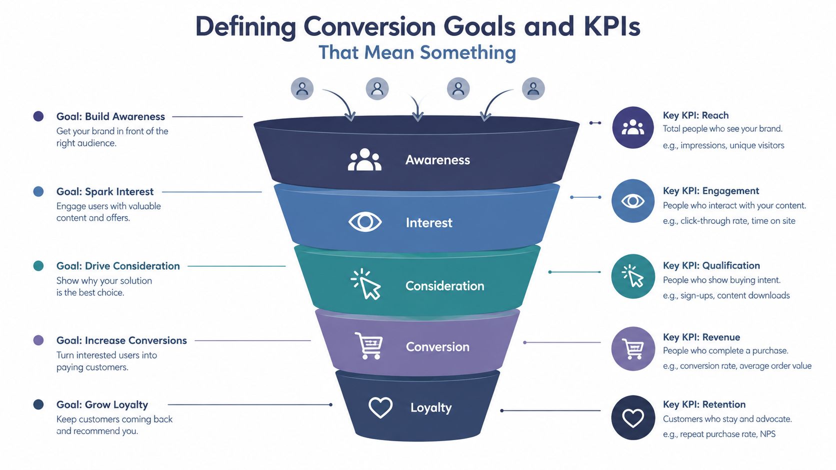
Before changing a page, write down what a successful action means. “Improve engagement” is too vague to guide a test. A product page may need a completed purchase, a service page may need a qualified inquiry, and a booking page may need a confirmed appointment.
Give every page one primary KPI tied to its intent:
Purchase page: completed transaction.
Lead page: qualified form submission.
Signup page: completed account or trial registration.
Booking page: confirmed booking request.
Pricing page: progression to the commercial action, such as a demo request or checkout.
Track supporting micro-conversions, but don't let them replace the business outcome. Product views, pricing clicks, video plays, form starts, and add-to-cart actions can reveal intent or diagnose a leak. They're useful signals, not automatically valuable results.
Use a baseline that matches the question
A universal conversion target is misleading. The conversion optimization benchmark overview from Webtonic places median landing-page conversion at about 6.6%, with commonly cited industry ranges from 3.8% to 12.3%, while general website conversion rates are often around 2.35% to 3.68%. These figures describe different page types and intents, so comparing a lead-generation landing page with an entire ecommerce site can produce a false alarm.
Segment the baseline before forming an opinion. At minimum, separate:
Device: desktop, tablet, and mobile.
Traffic source: organic, paid search, email, referral, and other meaningful channels.
Page intent: education, product evaluation, lead capture, or purchase.
Audience state: new visitors and returning visitors where the data supports it.
One benchmark cited by Webtonic reports 5.06% for desktop versus 2.49% for mobile, which makes pooled performance particularly dangerous. A weak overall rate may hide a mobile usability problem, or it may reflect a channel that was never expected to convert at the same level.
Use this template before optimization:
For [audience segment] on [page], a conversion means [specific action]. The primary KPI is [metric], measured against [segment-specific baseline]. Supporting micro-conversions are [signals].
That sentence forces clarity. Without it, teams can celebrate more clicks while qualified leads, completed purchases, or revenue remain unchanged.
Auditing Your Funnel and Finding the Real Friction
A funnel audit should answer one practical question: where does a motivated person stop, and what obstacle appears at that point? Start with the path from entry to primary conversion, then break results into traffic source, device, and page intent. A blended average can tell you that performance changed. It usually can't tell you what to fix.
Review each stage separately:
Entry: Does the landing page match the promise of the ad, search result, email, or referral?
Evaluation: Can visitors understand the offer, price, proof, and next step without hunting?
Commitment: Does the form or checkout ask for information that feels necessary?
Completion: Are payment, delivery, errors, and confirmation clear?
Mobile deserves its own investigation rather than a responsive-design checkbox. Smaller screens amplify weak hierarchy, cramped fields, poor keyboard behavior, slow loading, and payment-entry problems. The benchmark cited above shows why this matters, but the operational question is more useful than the comparison itself: which mobile step loses the most valuable visitors?
Rank friction by evidence
Look for behavioral signals that point to a specific blockage. High exits after shipping information suggest cost or delivery uncertainty. Repeated form errors suggest field design or validation trouble. Visitors returning to pricing or FAQ content may lack information required for a confident decision. Rage clicks, hesitation, and repeated backtracking can reveal interface confusion that aggregate analytics misses.
Checkout friction often comes from predictable triggers, including:
unexpected additional costs
forced account creation
security concerns
slow or unclear delivery choices
unnecessarily long checkout flows
The Merchant Risk Council discussion of checkout optimization also highlights an important qualification. One-click checkout can improve completion and order frequency, but adoption varies across age groups, with younger users adopting it more strongly than older users. A shortcut isn't automatically a universal solution.
Produce a ranked list
Don't finish the audit with “simplify the funnel.” Produce a short ranked list using three criteria:
Reach: How many relevant visitors encounter the issue?
Severity: How strongly does the issue block the primary action?
Control: Can your team fix it without changing the entire business model?
That ranking turns observation into operating work. If a mobile payment field blocks completion, rewriting a desktop headline can wait. If visitors understand the offer but reject the economics, a new layout won't rescue the page.
Payment experience belongs inside the audit. PayPal's accelerated checkout coverage cites that 41% of UK customers struggle with basic payment-entry tasks, a reminder that conversion failure may sit in a payment interface rather than a landing page. Treat the funnel as a connected system.
Choosing the Right Fixes for Each Friction Point
The right fix depends on the symptom. Teams waste time when they apply testimonials to a form problem, shorten a form when the offer is weak, or redesign a checkout that merely needs clearer costs.
Friction Symptom | Best Fix Family | Example Tactic |
|---|---|---|
Visitors don't understand the benefit | Copy | Rewrite the headline and supporting value proposition around the customer's intended outcome |
Visitors see the offer but don't act | CTA | Make the action specific and state what happens next |
Visitors abandon during interaction | UX | Improve field order, error handling, autofill, spacing, and mobile controls |
Visitors hesitate because the exchange feels poor | Offer | Reconsider pricing, packaging, delivery terms, or perceived commitment |
Visitors question safety or credibility | Trust signals | Place relevant reviews, guarantees, policies, or security information near the decision point |
Copy and CTA fixes
Copy is appropriate when the page creates confusion. Match the promise to the visitor's entry source, explain the outcome plainly, and answer the first serious objection near the action. A CTA should describe the benefit or commitment accurately. “Request pricing” sets a different expectation from “Start checkout,” and misleading urgency may create short-term clicks while damaging trust.
UX and form fixes
Use UX changes when people understand the offer but struggle to complete it. Remove fields that don't support the immediate decision, enable autofill, clarify errors, and make touch targets usable on mobile. Shortening a form should come before adding another testimonial when recordings show visitors stopping at a difficult field.
Offer and trust fixes
No button treatment can repair an offer that feels overpriced, risky, or operationally inconvenient. Unexpected costs, delivery uncertainty, and missing payment choices require commercial or fulfillment changes, not decorative improvements.
Trust signals help when doubt is the barrier. Put proof beside the claim it supports, use specific customer evidence where available, and make policies easy to find. Don't cover a weak promise with a wall of logos.
One-click checkout illustrates the trade-off. It can reduce effort for some customers, yet uneven adoption means the fallback path still matters. Optimization means removing friction without removing choice.
Running A/B Tests You Can Actually Trust
A test is only useful if its result deserves belief. Start with one primary KPI and write a hypothesis before launch. A useful format is: “If we change X for Y audience, Z will improve because reason.” That sentence prevents vague tests such as “make the page better.”
Calculate the required sample before exposing traffic to variants. Practitioners commonly seek hundreds or even 1,000+ conversions per variant for reliable significance, as described in the conversion lift study methodology. Another benchmark recommends 250 to 400 conversions per variant and at least two full weeks of runtime, also noting that weekday and weekend behavior should be covered, according to Webtonic's CRO methodology. These are planning references, not permission to stop testing on a calendar date regardless of traffic quality.
Protect the experiment
Test one meaningful variable at a time unless you have a design and sample size that can support interactions. Keep the audience definition stable, record the launch date and hypothesis, and avoid repeatedly checking the result until a preferred outcome appears.
The common self-inflicted errors are straightforward:
Stopping early: A temporary lead can disappear when the full traffic cycle arrives.
Pooling unlike visitors: A result can hide a mobile loss behind a desktop gain.
Chasing significance alone: A statistically valid lift may be too small to matter operationally.
Overfitting: A winner can reflect an unusual audience mix or random variation.
Changing several elements: You lose the ability to identify the cause.
Most experiments won't produce a dramatic improvement. That's normal. An inconclusive test can still eliminate a weak hypothesis, while a modest validated gain can become valuable when the program keeps moving.
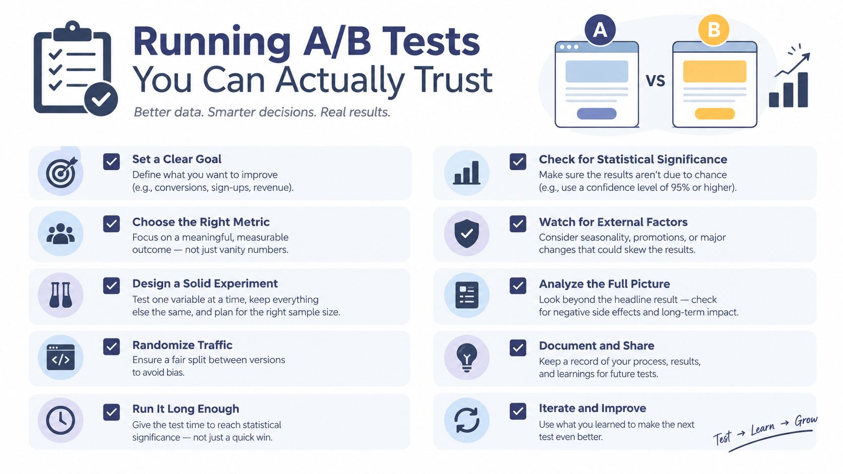
Before launch, confirm:
The primary KPI is defined.
The audience and segment are specified.
The hypothesis names the change and expected behavior.
Sample size was estimated in advance.
Variants differ only where intended.
Tracking fires correctly.
The test covers complete traffic cycles.
Guardrail metrics are selected.
The decision rule is written down.
The result will be judged for significance and operational value.
Use AI to accelerate analysis, not to outsource judgment. Richard Maize's perspective on when to use ChatGPT captures the broader operating principle: automation can help organize information, but the owner still decides which problem matters and what evidence is sufficient.
Conversion Lessons From Real-World Ventures
Conversion thinking didn't begin with landing pages. Any business that asks a person to say yes has a funnel, whether the steps appear in an analytics dashboard or across a leasing office, mortgage pipeline, or food truck queue.
Richard Maize's real estate background makes that visible. The Rochelle and Richard Maize Foundation describes how he built a portfolio of about 1,000 rental apartment units before age 30 and later founded and developed one of the most successful mortgage banking firms in the United States before liquidating it. Those milestones don't prove a particular website conversion lift. They do show the kind of repeated operating exposure that makes friction easy to recognize.
The rental application lesson
For a rental operation, prospective tenants need clarity about availability, qualifications, timing, documents, and next steps. A confusing application creates drop-off even when demand exists. The practical conversion question is not “How do we make the leasing page look modern?” It's “Which required step creates uncertainty or unnecessary effort for a qualified applicant?”
That can lead to better information architecture, clearer qualification language, faster response procedures, and a more predictable application path. The principle transfers directly to lead forms and booking flows.
The mortgage pipeline lesson
Mortgage banking adds a different constraint. The customer needs confidence, but the business also needs accurate information and appropriate controls. Removing every step may create downstream risk, so the correct optimization is often progressive disclosure, collecting what's necessary at each stage and explaining why it's required.
That's the same trade-off found in digital forms. Shorter isn't always better if it produces poor-quality leads or forces repeated follow-up. A smooth funnel balances customer effort with operational usefulness.
The Richeeze lesson
A food truck such as Richeeze Melts exposes friction in physical form. Customers decide quickly, scan the menu, join a queue, place an order, pay, and wait. Confusing menu language, slow ordering, unavailable items, or awkward payment steps can lose a sale immediately.
The lesson is transferable: observe the customer's actual path instead of defending the designed path. In person, the queue makes hesitation obvious. Online, teams need funnel data, recordings, support questions, and form analytics to see the same behavior.
Maize's philanthropic platform also reflects a broader trust principle. The Rochelle and Richard Maize Foundation supports local and global causes and has regularly supported organizations including Vista Del Mar Child and Family Services and the Los Angeles Police Foundation. For any brand, credible proof works best when it's specific, relevant, and close to the decision that requires confidence.
Your Conversion Improvement Starting Sequence
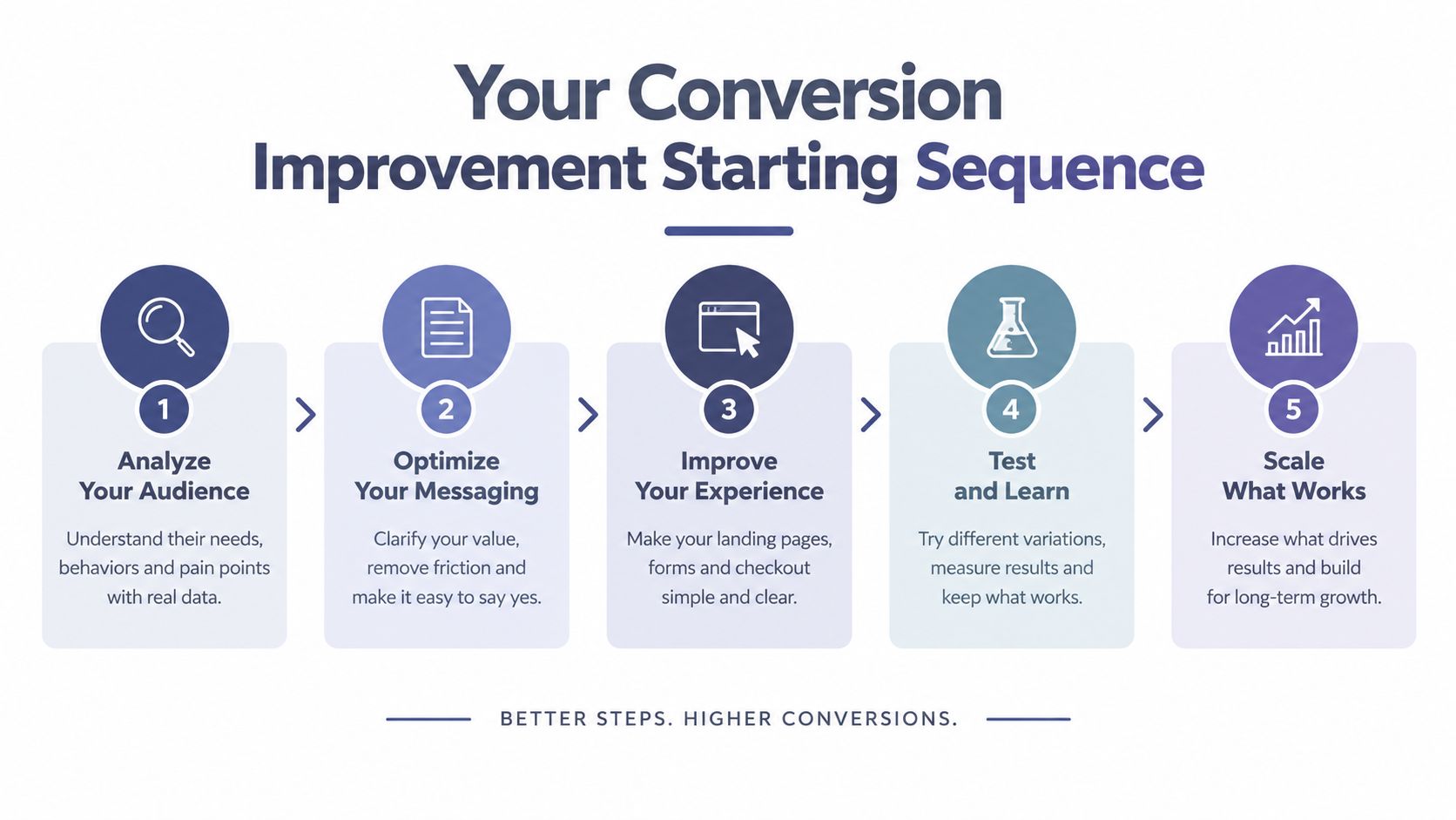
Start with the smallest sequence that creates reliable learning. Don't begin with a redesign brief. Begin with a page, an audience, and a business action.
Define one primary KPI. State exactly what counts as a conversion for the page.
Benchmark by segment. Separate device, source, and page intent before judging performance.
Find the highest-friction point. Use funnel data and behavioral evidence to rank problems.
Deploy the matching fix. Choose copy, CTA, UX, offer, or trust based on the symptom.
Test the change properly. Pre-register the hypothesis, calculate sample needs, run complete traffic cycles, and judge operational value.
Document the result. Record what changed, what happened, and what the next question should be.
Build a cadence that survives reality
A useful cadence might begin with one high-value page and one bottleneck. Don't spread a small team across every template, audience, and channel at once. The objective is to create a repeatable loop that marketing, product, sales, and operations can understand.
The boring version of conversion work is usually the durable version: measure the right action, remove the right obstacle, and earn each improvement with evidence.
Richard Maize's discussion of scaling a business from startup to empire provides a fitting operator's frame. Scale doesn't excuse weak fundamentals. It magnifies them. A smoother funnel, clearer promise, and more dependable payment experience make every future acquisition effort more productive.
Choose one page this week. Write its KPI definition, pull performance by device and source, watch where users abandon, and select one fix that addresses the evidence. Then test it before moving to the next issue. Consistency beats intensity, and validated improvements compound far more reliably than dramatic changes made on instinct.
Richard Maize offers perspectives across real estate, entrepreneurship, investment, consumer ventures, and philanthropy, with practical lessons about creating value and reducing friction in real businesses. Visit Richard Maize to explore his work, blog, press features, and multimedia, then apply the same disciplined operating lens to your conversion improvement program.
Comments